Every time I click an email from Experian about my credit score changing—“Your score increased!” or “Your score decreased!”—I’m redirected to a login screen. But instead of taking me to my dashboard, I’m dropped into what looks like a checkout page.
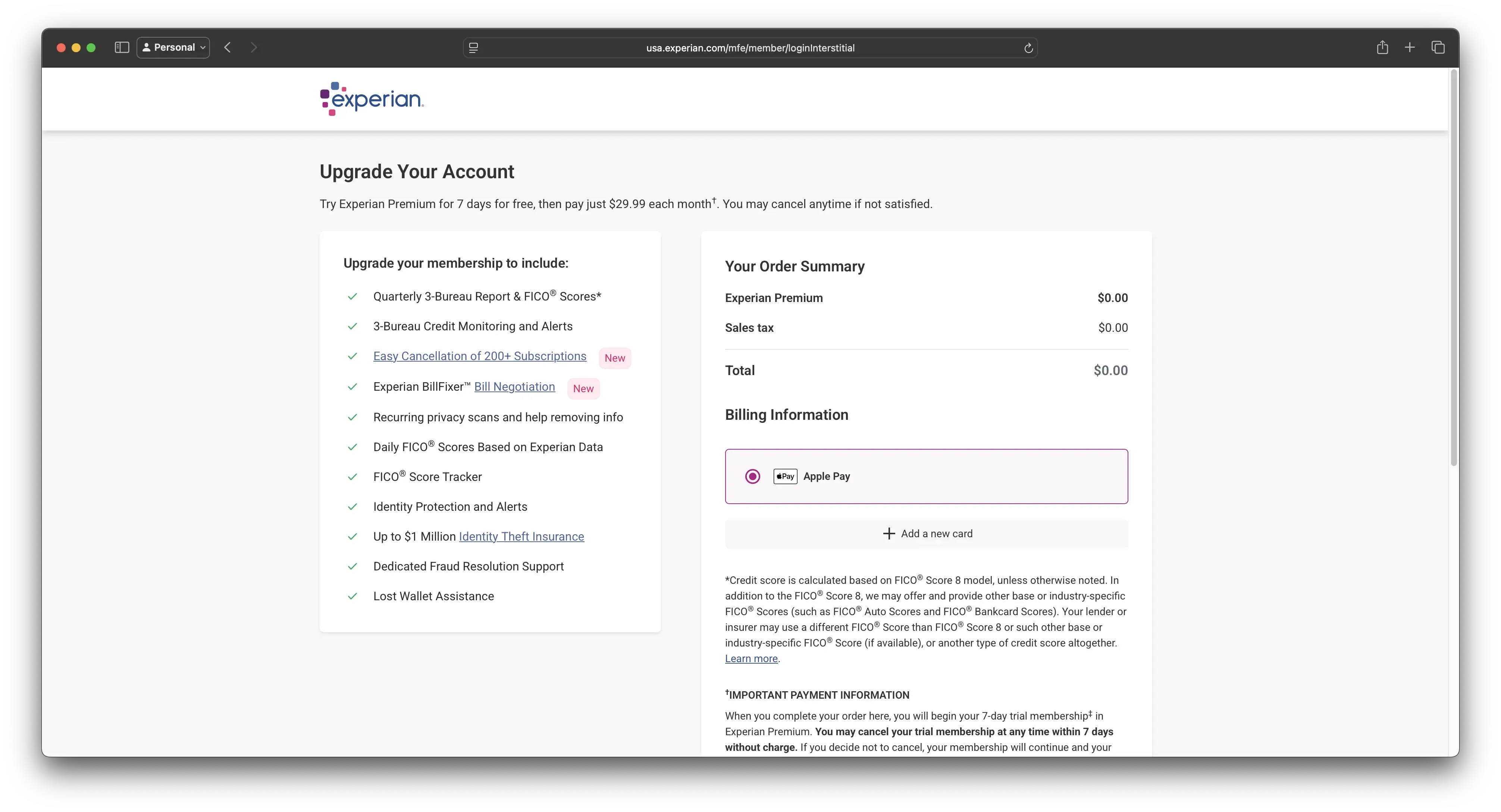
This screen promotes a 7-day free trial of Experian Premium for $29.99/month. The primary call to action is Apple Pay. The default button is styled to encourage quick confirmation. Meanwhile, the opt-out—“No, keep my current membership”—is styled as a secondary option and placed far enough down the page that it’s not visible without scrolling.
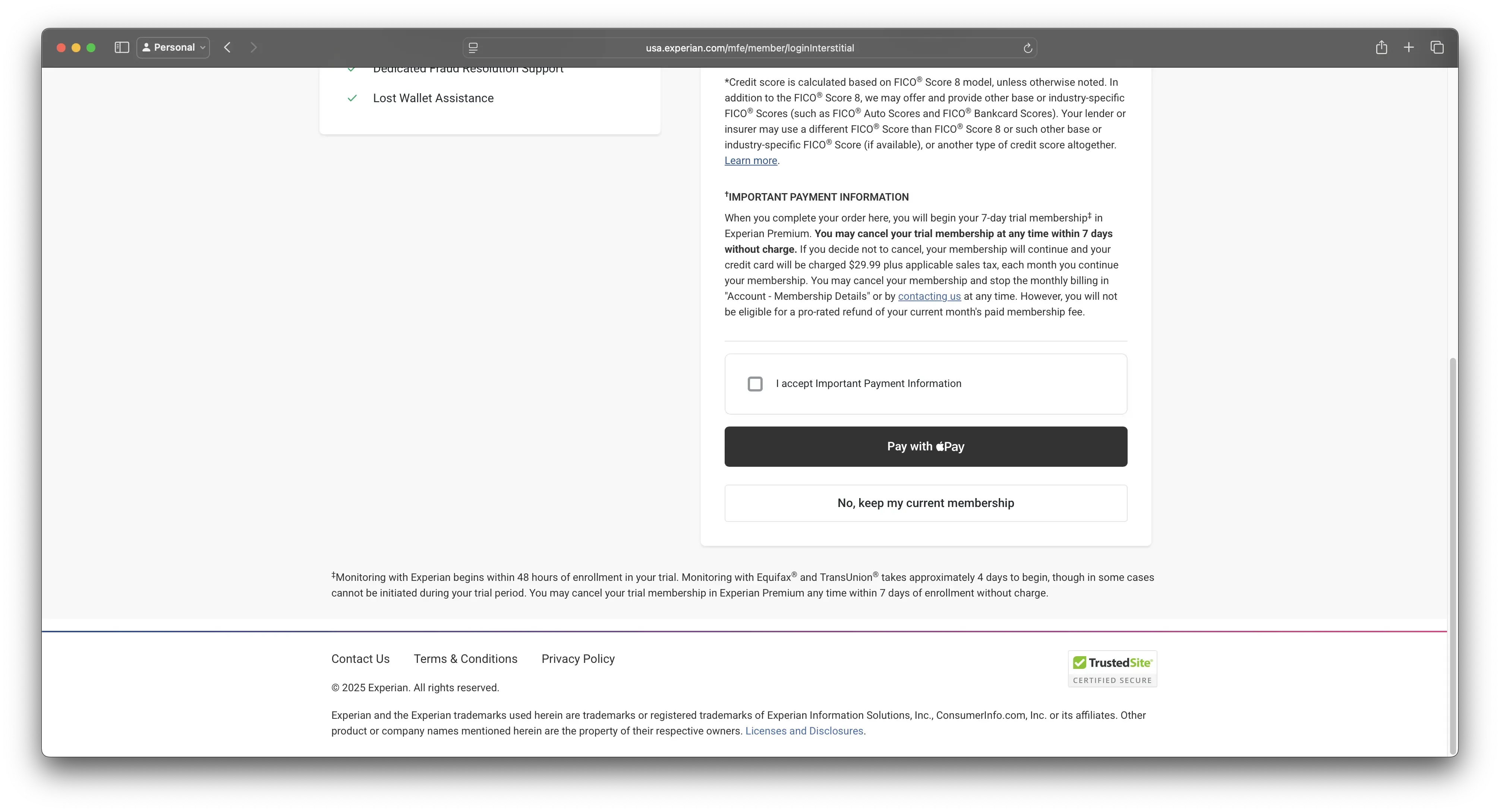
This isn’t just frustrating. It’s what many people call a dark pattern, though I prefer more specific language like manipulative interface or user-hostile design. These are deliberate choices that steer users toward outcomes they might not choose if presented clearly. You technically can bypass the upgrade, but it requires effort: reading closely, identifying the correct link, and scrolling past a large, branded payment button.
Why it matters
I never fall for this, but I still have to pause and assess each time. That’s intentional cognitive overhead. What’s more concerning is how many people do fall for it—people who may not be as tech-savvy, who may be older, or who may be experiencing financial stress. Those are the very people most in need of support and transparency.
Experian isn’t a startup growth-hacking its way to relevance. It’s a credit bureau entrusted with sensitive consumer financial data. Interfaces like this undermine that trust.
This pattern is subtle enough to feel like “just part of the flow,” but it’s widespread and well-documented. Whether you call it deceptive design, coercive UX, or choice architecture, the effect is the same: systems nudging people toward actions that serve business goals over user needs.
What we can do
If you work in product, design, policy, or consumer protection, you should be tracking these patterns. Audit flows that default to upgrades. Refuse designs that hide opt-outs. Push for transparency that respects the user.
People deserve clear choices. Not traps.
References
- Deceptive Design Hall of Shame (formerly darkpatterns.org) — a consumer-friendly site documenting real-world examples
- Mathur, A., Acar, G., Friedman, M. J., Lucherini, E., Mayer, J., Chetty, M., & Narayanan, A. (2019). Dark Patterns at Scale: Findings from a Crawl of 11K Shopping Websites. arXiv:1907.07032
- Bösch, C., Erb, B., Kargl, F., Kopp, H., & Pfattheicher, S. (2016). Tales from the Dark Side: Privacy Dark Strategies and Privacy Dark Patterns. In Proceedings on Privacy Enhancing Technologies, 2016(4), 237–254. PDF link